1 - Getting started with the Ribbon Workbench
Getting started with the Ribbon Workbench
In this chapter we are going to look at the basics of using the Ribbon Workbench for CRM , and cover the following points:
- What is the Ribbon Workbench?
- Installing the Ribbon Workbench
- Creating and loading a solution into the Ribbon Workbench
- Adding a button to a ribbon
- Defining a button command
- Publishing your solution
- Hiding Standard Elements
What is the Ribbon Workbench?
The Ribbon Workbench for CRM is a tool written to make customizing the Ribbon easier and quicker. The Ribbon is the user interface element that appears at the top of all recent Microsoft Applications, and was the successor to the old ‘toolbar’. Rather than have a single toolbar that was full of all command buttons and a set of drop down menus that could be multiple layers deep, the Ribbon attempts to show only the commands that you need depending on the task that you are doing. The ribbon also attempts to scale to the available window width, making some less important commands smaller or even move them to drop down menus when the space is limited. The ribbon designer decides on the importance of each command and therefore the order in which commands are ‘demoted’ as the window width is reduced.
Before the Ribbon Workbench, there was the CRM2011 Ribbon Visual Editor that allowed the simple addition of buttons and groups to existing tabs, but any more complex scenarios such as drop down menus, changing the ‘out of the box’ ribbons or adding new tabs was confined to the realms of editing page upon page of hard to understand xml.
The Ribbon Workbench for CRM was written to provide a ‘drag and drop’ developer experience that allows all customization scenarios to give complete control over your CRM ribbon & command bar!
Note: Although CRM2013/2015 has the command bar - the underlying mechanism still has the Ribbon structure and so we still talk about the Ribbon in this article.
Installing the Ribbon Workbench
The Ribbon Workbench is a CRM 2011 solution (If you are not sure of what a CRM solution is, I suggest you read an Introduction to Solutions before carrying on). To install you will need to follow these steps:
1. From within Dynamics CRM 2011, navigate to Settings → Solutions → Import
2. Download the Ribbon Workbench, and then select the downloaded solution file and following the instructions.
3.
Once imported, you can click the
‘Ribbon Workbench’ button on the ribbon. This button is only visible
if you have customizations rights and you are in the ‘Solutions’
area.
Creating and loading a solution into the Ribbon Workbench
The Ribbon is edited in two distinct ways:
- Edit the Application Ribbon to make changes system wide (e.g. add a button once that appears on forms on all records)
- Edit individual Entity Ribbons to make changes for a specific entity (e.g. add a button only to the contact form)
If you wanted to add a button to the Contacts Form Ribbon (the form shown at the top of the form when editing a Contact), you would add the Contact entity to a solution and load it into the Ribbon Workbench. If you wanted to add a button to all Form tabs for all entities you would add the Application Ribbon to a solution.
To add the Contact entity to the solution
1) Navigate within Dynamics CRM to Settings → Solutions → New
2) Enter the name of the solutions (e.g. 'Contact') and click 'Save'.

3) Now select Components → Entities → Add Existing → Contact
To add the Application Ribbon to the solution
1) Within your solution, select Components → Client Extensions → Add Existing → Application Ribbons
Solution Webresources
Webresources are simple files that can be uploaded into a solution that can be used by your customizations. Later on we'll see how you can use webresources to provide scripts that can be executed via buttons on the ribbon, but for now we'll concentrate on simply adding an image webresource. Since we are going to create a new button on the ribbon we’ll need some pretty images to put on them.
Ribbon buttons require two images of type png, gif or jpg. The two sizes are used when the ribbon resizes to fit the available window width. If there is limited space, a button can change into a smaller button or become a drop down menu. Here are two example button images of the correct size that you can use.
-
![Description: C:\Users\sdurow\AppData\Local\Microsoft\Windows\Temporary Internet Files\Content.Word\new_Image16[1].png](http://www.develop1.net/RibbonWorkbench/figures/clip_image012.png) 16x16
PNG format
16x16
PNG format -
![Description: C:\Users\sdurow\AppData\Local\Microsoft\Windows\Temporary Internet Files\Content.Word\new_Image32[2].png](http://www.develop1.net/RibbonWorkbench/figures/clip_image013.png) 32x32
PNG format
32x32
PNG format
You can create these images in any image editing package – a great free tool is Paint.NET.
To add these images to your solution, you need to:
1) Within you solution, select Components → Web Resources → New
-
Name: new_Image32.png
-
Display Name: Image32.png
-
Type: PNG
-
Upload File: Select your 32x32 image file
2) Within you solution, select Components → Web Resources → New
-
Name: new_Image16.png
-
Display Name: Image16.png
-
Type: PNG
-
Upload File: Select your 16x16 image file
You should now have a solution that likes:

Now go ahead and open the Ribbon Workbench from Settings→Solutions→Ribbon Workbench and when presented with a list of solutions, select your newly created solution named ‘Contact’.
You should be presented with a view of the ‘Home Page’ ribbon of the contact entity.

Before we look at the different parts of the Ribbon Workbench, go ahead and have a play - nothing is saved until you click 'Publish Solution'!
Top Bar
The top bar provides the main control over loading and publishing solutions

Ribbon Editor Panel
The Ribbon Editor Panel provides the main design surface for editing the currently selected entity ribbon. Each ribbon is divided into different tabs. When you select the Application Ribbon you'll see many more tabs that if you select the 'Contact' entity.

 A
really import thing to notice at this point is that here are a
number of different types of ribbon tabs that can be edited by
selecting from the drop down in the top right of the Ribbon Editor
Panel.
A
really import thing to notice at this point is that here are a
number of different types of ribbon tabs that can be edited by
selecting from the drop down in the top right of the Ribbon Editor
Panel.

- Homepage – Tabs that are displayed in the main CRM 2011 application screens.
- Form – Tabs displayed when a specific record form is opened.
- SubGrid – Tabs shown when a list view is selected on a specific record form.
-
Jewel – The menu options that available when the ‘Jewel’ is selected. This is the blue ‘File’ tab that is show on the left hand side of the Homepage ribbon. These are only editable when the ‘Application Ribbon’ is selected.
Try selecting different types of ribbon and see which tabs are shown.
Toolbox, Entities and Solution Elements
You'll notice the panels shown under the Ribbon Editor Panel. You can select the divider bars between these panels to resize them to the position that suits you best.

Toolbox Panel - The toolbox allows you to drag and drop ribbon controls on to the ribbon design surface. When you drag an item it must be positioned next to where you would like it to appear. The cursor will change to a blue plus icon when dropping the control is allowed. If you want to place a new tab, you must drag the tab control directly next to an existing tab, rather than drop it where the controls appear.
Entities Panel - The entities that you included in your solution will appear as a list in the Entities Panel. By selecting an entity, the Ribbon Workbench will show you the tabs that are available for that entity and the currently selected ribbon typeSolution Elements Panel - This panel is one of the most important areas for understanding your ribbon customizations. As you drop items on the Ribbon Design Surface, Custom Actions will appear in the Solution Elements. Later we will look at what each of these elements mean.
Adding a button to the Ribbon
Let's start by adding a button to the 'Records' area of the Contact Form Ribbon:
1) Select the 'Form' ribbon types in the top right drop down list
2) Select the 'Contact' entity in the Entities Panel
3) Drag a button from the toolbox onto the 'Records' ribbon group.

Try dragging the button to different places - you'll see that some places will show a 16x16 button and some places will show a 32x32 button. This is because the Ribbon template defines the size of buttons in each layout area within each group. At this stage we should take a look at how the ribbon is made up.

Each tab is sub-divided into the following elements:
 Groups - Groups each have a title and group
buttons on a tab
Groups - Groups each have a title and group
buttons on a tab
 Layouts - Each Group is
sub-divided into multiple Layouts which then contain
controls that are all shown at a particular size.
Each Layout is assigned a different size by the
template layout that is selected. More on this
later.
Layouts - Each Group is
sub-divided into multiple Layouts which then contain
controls that are all shown at a particular size.
Each Layout is assigned a different size by the
template layout that is selected. More on this
later.
 Controls - The Controls are
positioned within each Layout. When the ribbon is
shown to the user, they can't see the different
layouts, only that in each group, there are buttons
shown at different sizes.
Controls - The Controls are
positioned within each Layout. When the ribbon is
shown to the user, they can't see the different
layouts, only that in each group, there are buttons
shown at different sizes.
Whenever a ribbon is part of the
loaded solution it will show a red tick ( ).
It is important to understand here that you can customise out of the
box ribbon elements, or add new ribbon elements. In both cases the
elements will have a red tick on them since they are included in the
solution. If you customise an out of the box group or add a new
group, a red tick will appear on all of the buttons in that group.
If you customise or add a new tab, a red tick will appear on all of
the groups and buttons in that tab.
).
It is important to understand here that you can customise out of the
box ribbon elements, or add new ribbon elements. In both cases the
elements will have a red tick on them since they are included in the
solution. If you customise an out of the box group or add a new
group, a red tick will appear on all of the buttons in that group.
If you customise or add a new tab, a red tick will appear on all of
the groups and buttons in that tab.
Setting the Button Images
If you remember earlier we added two images to our solution for use on our button. We can now specify these by selecting our Button and using the Property Panel.

Click the search icon on the Image16by16 and Image32by32 Property and select the corresponding image from those in the solution.
The Ribbon Workbench only
shows webresources selectable if they have been added to the
solution currently loaded.
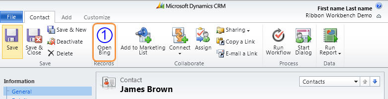
Go ahead and drag your new button around on the ribbon to see where it can go. You'll notice that in some Layouts it will show as the 16x16 button, and in some it'll show as 32x32.
At this point you may also like to change the LabelText from 'Button' to something like 'Open Bing' using the 'LabelTextText' property. You will notice that you can change the Language using the drop down box at the top of the Properties Panel. The available languages depend on those that you have provisioned inside your CRM Organisation.
Defining a Button Command
Now we have a button, the next item on our TODO list is to define what happens when the user clicks it. There will be much more on this later, but for now, we'll simply make it open a new IE window that contains a Bing search page.
1) Navigate to the Solution Elements Panel → Commands → (Right Click) → Add New
2) Expand the Commands Node and select the new command. You'll see that it has been given an ID that uses the solution prefix in the format:
new.contact.Command0.Command
The prefix can be changed to your choice by using the Information
Tab of your Solution and selecting the 'Publisher'. The Prefix can
be edited and saved.
For this to take effect in the
Ribbon Workbench, you must re-open your solution.

3) You have the option of changing the ID using the Properties Panel. This Panel will show the properties of which ever element you have selected in the Workbench.

The Ribbon Workbench creates a consistent naming convention for
your ribbon elements, so it's advisable to only change the Command0
bit.
E.g.
new.contact.OpenBingWindow.Command
4) You may be wondering why we are creating a new command when we have already added a button to the ribbon. This is because the Ribbon allows a command to be defined such that it can be used by multiple buttons. So although we are only going to associate our command with the new button, we could add more buttons that all call the same command. Commands use 'Actions' to define what should happen when a user clicks any associated buttons. To define the Actions, click on the magnifying glass icon next to the 'Actions' Property:

5) Any existing actions that are defined for this command would display here, but because it is a new command, the list will be empty. Go ahead and click 'Add' to create a new one and select the 'Open Url Action'. The other 'Javascript Function Action' option is for more complicate actions that involve calling code, but more on this later.
6) Now we set the properties of the action:
- Address: http://bing.com
- WinMode: Window
- WinParams: resizable=yes
The WinParams is a string that has a structure depending on the
WinMode.
For a Normal Window refer to
http://www.w3schools.com/jsref/met_win_open.asp
For dialog windows, refer to
http://msdn.microsoft.com/en-us/library/ie/ms536759(v=vs.85).aspx
7) Now that we have oure command, click Ok, and the select our new button in the ribbon. The Properties Panel should now show the Properties for the ID. You could rename the button ID if you liked at this point.
To ensure that the OpenBingWindow Command is called when the user clicks the button, select our command from the Command Property Drop down:

Publishing the solution
Now that we have everything setup, we can publish our solution to make the user interface available to the user. To publish, simply click on the 'Publish Solution' button on the Top Bar.
The publish may take a little time depending on how much resources your CRM Server has been allocated, but once finished, you should be able to navigate to a Contact record and use the new button.
You may have noticed that after the publish was completed, the Messages Tab is shown and displays some warnings:

To avoid these warnings you can select your button and provide some text for the 'ToolTipTitleText' and 'ToolTipDescriptionText' properties.
The Ribbon Workbench will always download the latest entity customisations (attributes, forms, webresources etc.) before publishing your ribbon customisations so any changes that have been made since you opened the solution (other than ribbon changes) will be preserved provided they are not published in between downloading and re-uploading. If you have multiple people working on your solution, you need to be careful that two people are not publishing their customisations to the ribbon at the same time since the last person to publish will overwrite the ribbon changes of the previous person.
Hiding Standard Elements
If you wanted to remove the button that you've just added, you can simply 'Right Click' on the button either in the ribbon, or in the Solution Elements Panel and click 'Un-Customise Button'. You may have noticed that whenever you drop an element onto the ribbon, it shows up in the Solution Elements Panel so that you can keep track of what you have customised. If you select the button in the Solutions Elements Panel, the button in the ribbon is also selected so that you can easily find it, even if it's on a different tab type to the one currently selected (Form, Home Page, Sub Grid).

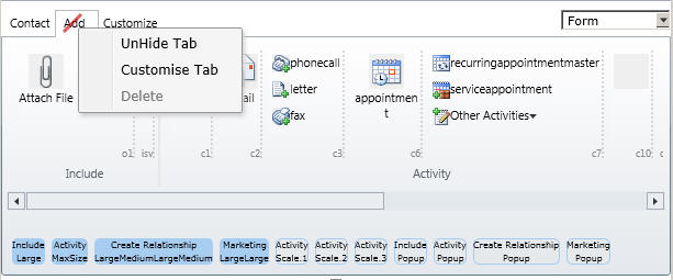
If you needed to hide a standard button, or tab for what ever reason, the Ribbon Workbench makes it easy to do so:
1) Select the Button or Tab that you would like to hide, and select 'Hide' from the 'Right click' menu. You will notice that the element now has a red-line through it, indicating that it will be hidden.
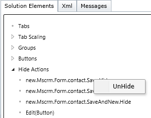
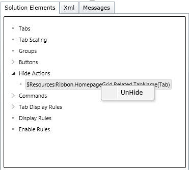
At any point you can then use 'UnHide' in the same way. Just as with new buttons appearing in the Solution Elements, when you hide a ribbon element it appears in the Solution Elements as a 'Hide Action'.
Once you have published a
solution with an element hidden, it will no longer show in the
solution ribbon when loaded again. If you want to 'Un-Hide' it after
publishing you must locate the Hide Action in the Solution Elements
Panel, and select 'UnHide'
Summary
In this chapter we have learnt the basics of using the Ribbon Workbench, adding a new button, associating it with a command, and publishing the solution. We also looked at hiding ribbon elements and how to unhide them.
In the next chapter we will look at the different types of Ribbon in a bit more depth so that you can understand where you need to make your customisations.